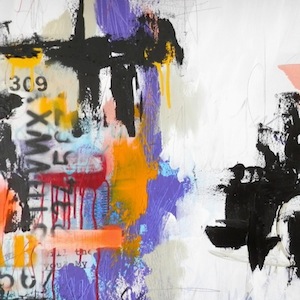
Wine and Art is an ongoing GFR series on the relationship between the two creative endeavours by working artist and author Lorette C. Luzajic, whose work The Last Time I Showed Up At Midnight is reproduced as the fourth illustration below. 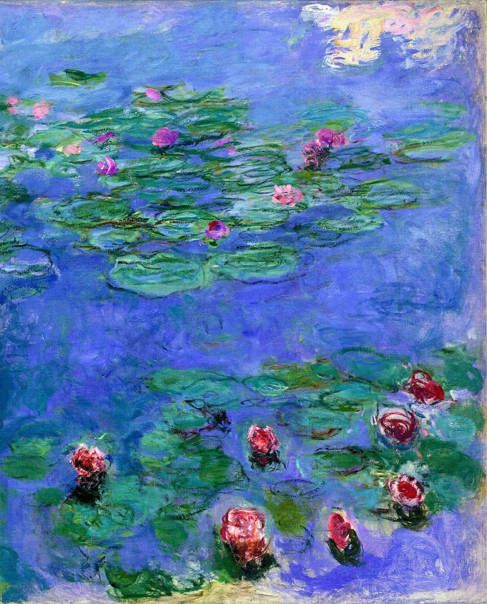 “Colour is my day-long obsession, joy, and torment,” said Impressionist painter Monet, whose gauzy, sun-dappled haystacks and water lilies became eternal favourites of art audiences the world over. Colour drives most artists, and it is also one of the primary draws for viewers. We respond with intense emotion to colour. Color evokes spontaneity, nuance, stark drama, poetry, heartbreak, eroticism, and joy. We may never fully understand why or how but respond to colour cues viscerally. It seems we are hardwired to do so. Paul Gauguin left France for the exotic colours of the tropical islands. “Life is colour,” he said. “…What a deep and mysterious language, the language of dreams.”
 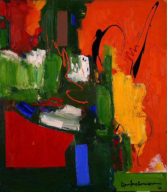 Hans Hoffman’s geometric abstract expressionist paintings are immediately recognizable as his because of his intense use of colour. “Our entire being is nourished by colour,” he said.
 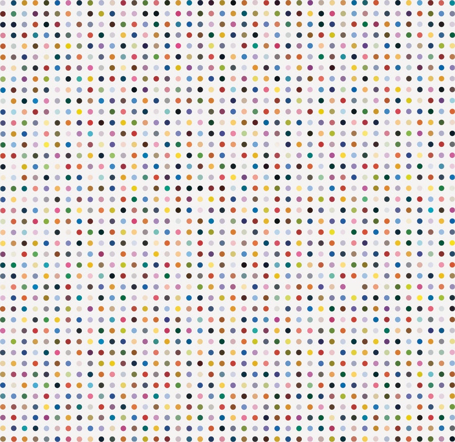 “I’ve always had a phenomenal love of color,” said artworld enfant-terrible Damian Hirst of dissected shark fame. The “joy of colour” was the inspiration for his massive series of 300 dot paintings. But perhaps it was Russian-Jewish artist Marc Chagall who said it best. “Colour is everything,” he said simply. Colour is also the first sensory experience we have of wine. Even before its olfactory bouquet greets us, our eyes take in topaz, garnet, sage. We use clear glass vessels to drink wine from, not chunky coffee mugs that say “Best Dad Ever” or Star Wars picnic tumblers, and this is one good reason why. Our experience of wine begins visually, and anything other than simple, transparent glass or crystal is a distraction. Connoisseurs can tell a great deal about the age, taste, quality, and even region of a wine from colour alone, and we enthusiasts can deepen our enjoyment too by learning some of these basics. For example, a chartreuse, bottle green is characteristic of great white wines as they mature. A similar shade with a more neon, Kool Aid tinge is a very young wine. Anything too tawny or orange might be oxidizing unpleasantly and is best sent back- but if the orange is more coral or salmon, this denotes dark grapes vinified with little skin contact- a real treat for variety loving imbibers. With reds, a brilliant ruby is young and juicy, and a thinner, purple-mahogany is elegant and expensive.
 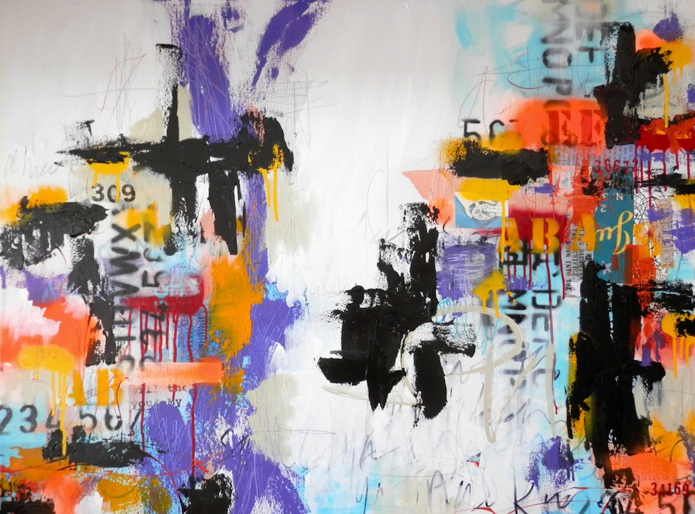 Taking in the colour cues of the world around us gives depth to our experience and enjoyment, and gastronomie is no exception. Imagine if all of our foods and beverages were putty-coloured. Would wine be drinkable without a range of mauve and scarlet and lemon? We can revel in how candlelight punctures the opacity of a crimson Shiraz, glittering red stars in your hand. And we can take refuge and refreshment in Viognier’s pale fire. Hold up your glass to the moon, to the morning, to midday sunlight and really take in the shades and tints. Don’t worry about the “right” light- colour always changes with the light, which defines it. Just look, and look again when the light changes- as Monet did, painting countless of the same scenes at different hours of the day. Colour is poetry- this is exactly the point William Carlos William made in so few words: so much depends upon a red wheelbarrow… beside the white chickens.
 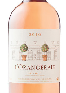 In addition to his comparative light experiments, consider the pastel palette Monet used. He liked to allude to black without using it, layering other colours to create darkness. He was so adamant about avoiding black that at his funeral, a friend swapped his black casket sheet for one with floral patterns. Monet loved misty violet, foam green, pure sunshine. To retreat more deeply into his ethereal world, dizzy with light, it is a precious thing to while away the afternoon in a garden sipping Lorgeril L’Orangeraie of Pays D’Oc (LCBO# 279661 – $11.00) . This is my current blush of choice. I was first seduced by the hush of transparent orange, but the oddly-nostalgic whisper of baby aspirin on the palate keeps me returning to this one again and again. Another artist I admire eschewed brown, not black. My mentor and friend, the late Pat Moffatt, told me, “Brown is a zero…in my mind, brown is one big orgy of colour, that the brilliance of the truth of colour has been lost.” It’s hard to argue with the resulting clarity and intensity colour has in Moffatt’s work. I observed in my book Dendrite Pandemonium, “This act of symbolic omission creates stunning works that vibrate with a luminous beauty I’ve never seen before. There’s a certain purity, and maybe that’s exactly what the artist is longing for. The colours shine like stained glass, like a lighthouse clear and bright over shadowy pines and a dark bay.” Moffatt’s work is best appreciated with pure and simple wines that glow in the dark. I recently tried South Africa’s Cathedral Cellar Chardonnay, fittingly aged under stained glass vaults, and its exceptional clarity was divine. Moffatt worked furiously and frantically, channeling Van Gogh’s brushwork energy. He created every one of his paintings in one sitting. They built up inside him, until they were ready, and then in a whir they came to life.
 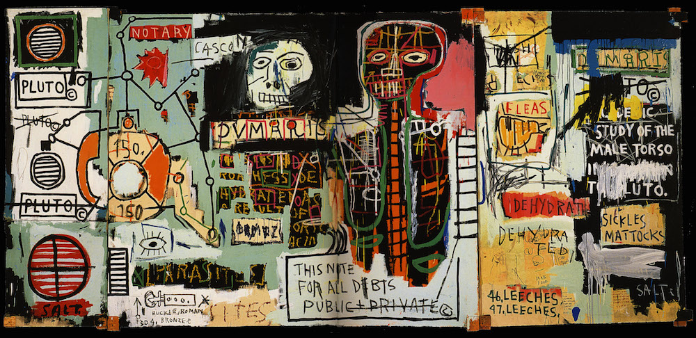 Jean Michel Basquiat’s work had a similar rhythm, but they unfolded rather than being formed in advance. The frenzied cacophony of colour in is intentionally jarring, and pairs best with something less traditional. Contemplation of his work requires wine that is rogue, experimental, rebellious.
 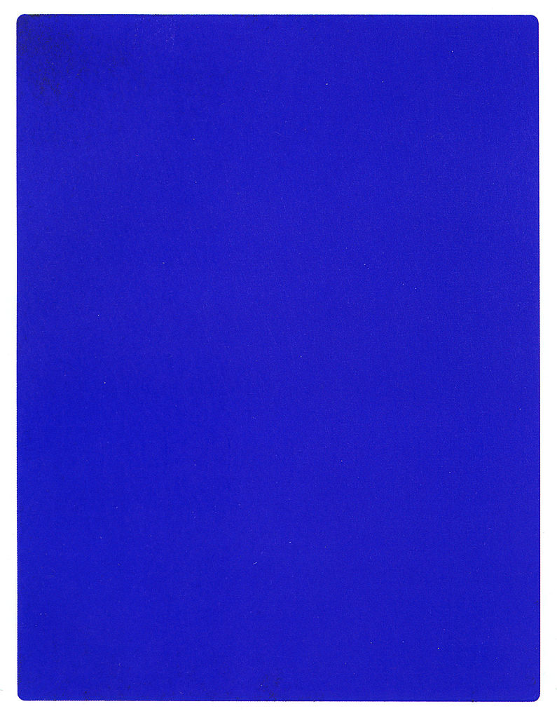 But afterwards, slip into something a little more comfortable, and consider the equally modern but far more minimalist oeuvre of Yves Klein with a clean, classic Riesling. Painting and wine are both arts that can evoke a range of senses and emotions, and colour is a primary provocateur. Art has no colour boundaries, of course, being free to mix and match from an eternal, unlimited spectrum of oceanic turquoise and egg yolk and lava pink. But wine’s visual expanse is also stunning. Forget red, white and pink and think about lavender, shrimp, sangria, dusty rose, and eggplant. There are at least fifty shades of grape.
 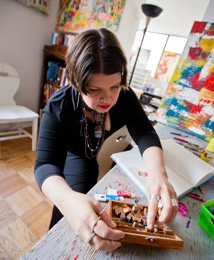 Lorette C. Luzajic is an artist and writer with roots in southern Ontario’s wine country soil. Native to Niagara, at home in Toronto, her work is inspired by wine, cheese, and bleak post-apocalyptic literature. If you missed her at the ROM or the Ritz, visit her at mixedupmedia.ca. Photo: Ralph Martin.
50 Shades of Grape
